Tattoo Design – Depth and Design
[GTranslate]
Table of Contents
Foreground.
Understanding position inside a design.
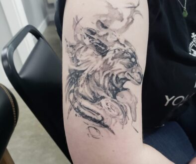
The foreground is the most forward part of the design. It is part of the design that sits in front of everything else. Usually, these parts o the design is flowing elements that have moved from the mid/background forward or they are an extension of the mid-ground focal point forward – a part of the design that “reaches” out toward the viewer.
This part of a design has the greatest amount of detail. This is because it is closest to the viewers perceived “eye”.
Look at the image below.
Can you pick out the foreground?
![]()
Mid-ground.
Creates balance in what you are trying to show your viewer.
The mid-ground is the “meat” (or veggies if you are vegan) of the design. The mid-ground is where our eyes as viewers are naturally attracted to. It takes its position between the foreground and background.
The mid-ground has detail, but not as much as the foreground. Just like in real life, your “eye” can pick out so much more detail when things are closer to you than if they are further away.
Take a look at the next picture.
Can you pick out where the mid-ground of the image is?
![]()
Background
What’s far away.
This part of your design limits image depth. The background is the “furthest” the design can go away from the viewer’s place. The background also sets the tonal range of design – making the background dark an artist can ensure the foreground appears brighter, (vice versa as well – a light background can make the foreground appear darker/deeper) – and control the contrast of the piece as a whole.
![]()
Take a look at the image above:
See if you can define where the foreground, mid-ground, and background are. Is there anything unique about the sizing and proportions that help your eyes understand where each section is?
Does the size difference between the rider and he shepherd make sense? Why are the rider and its horse so much smaller than the shepherd and flock?
UNDERSTANDING DEPTH IN AN IMAGE.
Planes – (Not The Kind That Fly)
In art, visual planes are imaginary lines that give your eyes a 3-D effect when reading an image. Your eyes navigate and interpret the direction, position, and movement of objects within the plane you are focused on – foreground, mid-ground, and background. In relation to each of the interpretations, your eyes create a scale which in turn manifests the concept of dominance in the image.
Let’s look at what each of those underlined words above means more by following the tabs.
Direction
Direction is how an object or part of a design interacts with the rest of the design or how the object leads our eyes into another element in the picture.
Direction can be given to individual aspects of the design, like an element of the horizon, long elements that cross one plane, or flowing parts of the design that move between planes.

Position in Design
This is where the object(s) is located in a design. An object in design has a position that is relative to something else: ie. the person next to the door.
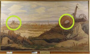
Movement
This is the path that a viewer’s eyes take as they move through a design. Flowing elements, planes, and object position should influence how you define the movement in your design. Since we are working with tattoos, this can easier to achieve when compared to photography (where you have to find the best possible setting to make your photo work).
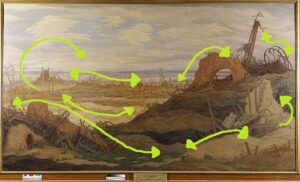
Final thoughts on planes.
Even though most tattoo designs may not seem like they have use planes to create depth, large scale designs demand the understanding of planes to look bold and hold-up over time.
Think about the body when you are making up a design:
- Try placing foreground elements on the parts of the body that stick out further than others.
- Place backgrounds on parts of the body that are naturally further away from peoples standing gaze.
- Sometimes the focal points you pick out will not line up with the design you are sketching up. Think critically
- How can you make it fit? Can you rotate the image or is there a way to shift the planes to fit the body better?
Practice Identifying the Foreground

Take a look at the picture we had seen earlier on the page. How easily identifiable is the foreground?
Practice Identifying the Mid-Ground
Take a look at this picture. How easily can you pick out the mid-ground? It may be more difficult given the uneven dimension of each plane.
Identify Planes in Abstraction
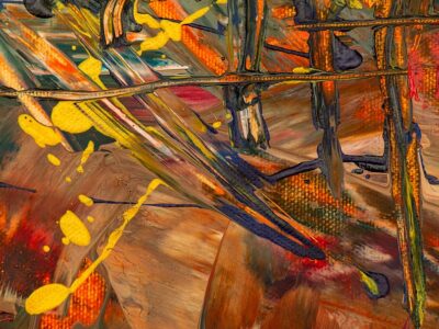
This one may throw you for a loop! Where do you think the foreground, mid-ground, and background are in this picture?
Last One…
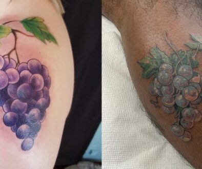
This picture plays a different trick to build the idea of depth. Pay attention to the colors used. What tones are drawn forward so that your assume they are closer? Which colors seem further away?
This picture should give you a slight hint of how depth can be effectively implemented in a design. This idea about assuming depth in an image also leads into the next section in this class.


